
TRUEFIT
UX/ UI Design, UX Research
TRUEFIT is a mobile application that uses Artificial Intelligence and Augmented Reality to help online apparel shoppers easily take body measurements and accurately find their size.
Users shop their favorite brands, use a 360° Body scanner to find their exact sizing, save their favorite stores and measurements, and even virtually try on clothing items so they are more confident about the items they buy and don't feel the need to overbuy items.
Project Overview
I was given the challenge of undertaking a chosen problem space to solve using the UX process and design thinking. This project can be thought of as my thesis or capstone and below, I will take you through my entire UX Design Process from ideation to Prototyping and Refining.
UX RESEARCHER | UX DESIGNER | WRITER | DESIGN STRATEGY
10 Week Duration
Case Study
iOS, Mobile Website
Figma, Invision, Veed.io
Case Study (Short Version)
Looking for the instant gratification approach? Look no further... Literally. For the detailed process, please keep scrolling.
Problem:
Online shopping returns contribute over 10M lbs of landfill waste each year. This is largely due to the high rate of online apparel returns, sizing confusion, and "bracketing."Bracketing is the consumer practice of buying one apparel item in multiple sizes due to sizing uncertainties and inconsistencies across brands. For example, if I am usually a size Medium, I would buy a medium, a small, and a large to turn my home into a fitting room.
Sizing charts and online reviews are untrustworthy or unclear, which makes bracketing the simplest solution to find my size. It is clear that shoppers don't know their size but they are looking for a better way to find it.
Solution:
TRUEFIT is an iOS mobile application that uses Artificial Intelligence and Augmented Reality to help online apparel shoppers easily take body measurements and accurately find their size right from their living room and from the palm of their hand.
Users shop all their favorite brands, use a 360° Body scanner to find their exact sizing and measurements, save their favorite stores and measurements, and even virtually try on clothing items so they are more confident about the items they buy and don't feel the need to overbuy items.

Case Study (Long Version)
Want the nitty-gritty details? Take a deep dive into how I used design thinking and a human-centered approach to help solve this fashion faux pas.

RESEARCH & DISCOVERY
The Problem Space
Problem Intro: An Environmental Fashion Faux Pas
Online shopping habits continue to grow and thanks to fast fashion brands, returning items is simple and usually free to consumers. Easy returns are great for consumers and businesses but the rate of online returns creates a massive problem with our Mother Earth.
According to the Environmental Protection Agency, online returns contribute to over 15 million metric tons of carbon dioxide (equivalent to 3 million cars on the highway) and 10 M lbs
Over 62.5% of online apparel returns end up in a landfill, while 3 million tons are immediately incinerated.


Secondary Research
Why is there so much waste from fast fashion?
When returns are fast, easy, and free then consumers have no reason to not overbuy. According to brightly.eco, greenamerica.org, and digitalcommerce360.com (just to name a few), consumers feel the need to resort to "bracketing" when shopping for apparel online.
And according to a 2021 Statista study, 48% of consumers say that they bracket clothing because of confusing or inconsistent sizing across brands.
Bracketing is a problem, but what IS bracketing?
"Bracketing" is the consumer practice of buying the same item online in multiple sizes or colors with the intention of simply returning unwanted items. This is largely due to unclear sizing or inconsistencies in sizing across brands.

But why does bracketing cause so much waste?
Simply put, brands want to save money and their brand image. According to brightly.eco, fashion brands, find it cheaper to dispose of items rather than restock them. Many would rather toss out their products than resell them at a lower price at the risk of tarnishing their image.
This is especially true in fast fashion brands like ZARA, ASOS, H&M, SheIn, and several others of the like.
Hypothesis
I believe online shoppers are confused by the sizing of apparel and do not know their true size, thus making it the biggest reason why consumers feel the need to overbuy and get many different sizes of the same item.
Giving consumers an easier and more effective way to know their true size EVERY time they online shop, no matter which store and which brand will help reduce bracketing, apparel waste, and return rates, while simultaneously having a positive impact on the environment and consumer happiness.
Metric for Success

I knew my hypothesis would be right when I saw that feedback from the market reflected that the main reason people overbuy clothing when online shopping is due to size in at least 75% of our respondents’ interviews and further research. I selected this unit for success because my next phase of research would consist of a small market sample size, and this majority amount would ensure that any mistaken interjected biases would not sway my results.
Primary Research
User Interviews
I wanted to dig deeper into this problem space and speak to real online shoppers about their current experiences to find out what sorts of barriers they encountered while completing an online shopping spree.
I conducted 4 user interviews in a decontextualized setting asking a series of scripted questions in an unbiased environment.
-
Tell me about a time when you placed an online shopping order?
-
What factors help you decide what you end up adding to your cart and purchasing?
-
How do you decide what size to get when you think you may be in between sizes?
(See the full interview script here.)

Age: 31 "I have such a hard time finding the right shoe size. It’s so annoying!!”

Age: 31 "I like when I can see an item on people that look like me, so I can see myself wearing it.”

Age: 32 “I don’t trust sites and what they say, so I like to see reviews and research more on sizing.”

Age: 31 “I usually end up buying multiples of things because I have no clue what my size is.”
Research Insights
Through synthesizing interviewee pain points, motivations, and behaviors via Affinity Mapping, I discovered 5 themes that organically presented themselves.
-
Pricing
-
Ease of Purchase
-
Shipping and Returns
-
Sizing
-
Picking An Item
I narrowed this down to 3 themes that would lead me to insights about my research.
Although all of these themes play a role in contributing to my problem space, I wanted to refine my focus toward the one that my secondary research backed up: Sizing
Sizing
Picking An Item
Shipping & Returns
Design Challenge
How might we help online shoppers find their size so they feel confident when ordering clothing and don’t resort to bracketing?
Competitive Research
Before I went into my ideating and even defining stage of my process, I wanted to conduct some competitive research to frame my defining and ideation phase in a way that would allow me to produce what would be a digital solution with a unique value proposition.
Is anyone doing anything about this fashion faux pas AKA bracketing?
I did some competitive analysis to find out what types of methods were being used to try to help shoppers find their size. Some of the current solutions consisted of:
-
Sizing charts
-
Multiple body types used in modeling
-
Garment walkthroughs and demonstrations
-
Catwalk videos showing live models wearing garments
Additionally, I noticed that there were similar solutions that allowed users to take body measurements and find their size, however, this was the sole feature of the product.
There was no one-stop shop for shoppers to conveniently find their size, save their size, and even help them envision wearing it.
Value Proposition
Helping shoppers conveniently find their size and envision wearing their size is TRUEFIT's what separates and elevates it from its competition. This is easily backed up by my interviews, themes and insights, and user stories.
DEFINE
Target Demographic
User Persona
Referencing my key insights, and themes taken from my user interviews I was able to craft an avatar that would represent the online shoppers that are impacted by the problem space. Doing this would allow me to quickly reference and solidly define a "real" person with the pain points, motivations, and behaviors that my interviewees expressed.

Experience Mapping
Referencing my key insights, and themes taken from my user interviews I was able to craft an avatar that would represent the online shoppers that are impacted by the problem space. Doing this would allow me to quickly reference and solidly define a "real" person with the pain points, motivations, and behaviors that my interviewees expressed.

User Stories And Epics
Now that I have researched and validated my problem through synthesis and analysis, it’s time to move on to brainstorming possible solutions in the ideation phase that would help answer our How Might We question.
Through user stories and epics I can get to know Haley even better and see which actions she wants to take so that she can reach her goals. I can align the design solution that I will create to the benefits she wants to see.
I was able to spot opportunity gaps within my experience map. This is what I will use as a foundation for creating my user stories so I can ensure I am giving my users the things they want and need in a digital solution.
The areas of opportunity I found as a base were:

I analyzed and grouped my user stories into common themes and functionality. Categorizing my user stories helps me identify my Epics, which will allow us to focus on our user task flows in the next step of the design process. Here are the 3 epics I found.

Core Epic
While my first epic to envision wearing the item and our third epic to Build Brand/Customer Trust are both important to users, neither will help me solve the root of our problem space. They may support my cause, however, if I focus my efforts on my second epic, Sizing and Measurements, I can come much closer to filling the gaps of opportunity that I have found thus far in my research.

Core Epic User Story Expansion
I then expanded on my core epic for Sizing and Measurement, highlighting all the common user stories that direct me towards a primary solution. These user stories will help me create me primary user task flow.
The task flow that I have created next, fulfills 9 out of 17 expanded user stories. That means over half of what my Persona wants and needs to see in Sizing and Measurement features is met by a singular solution.
Let’s check it out!

Primary User Story
User Story: As an online shopper I want to be able to scan my body measurements so I don’t have to measure myself and can accurately find my size in any item.
Task Flow
How will Haley reach her goal of confidentially finding her size in a creative way that she nor the market has seen before?
Before jumping into the task flow for the solution that I have come up with, let’s quickly examine our most compelling user story that encompasses Haley, my user's primary goal.

Task Flow Objective
We’ll create our task flow with this in mind to locate her direct path to her goal of getting sized using a feature like a Body Scan ID.
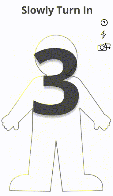
Task: Get Sized Using A Body Scan ID

IDEATE
User Interface Inspiration
To begin the ideation phase, I need to start with inspiration to research what’s already working in UI and find out how I may be able to incorporate those features and functionalities into my own work. During this process, I will be referencing my user stories often to target the main elements that Haley wants in her sizing solution.


I looked at apps that not only supported the fashion industry like Urban Outfitters and ZARA, but also ones that may meet Haley's request in a scalable measurement facilitator like an AR feature
Sketches
Using my UI inspirations, I'll begin drawing out the task flow that Haley will journey down to reach her goal.
I started with several fast, iterative exploratory sketches to hash out many ideas in a short period of time. From there, I refined it down to some of the most impactful solutions in each sketch to complete my solution sketches.
From these exploratory sketches, I pulled solution sketches, which can be viewed below. These are what I will be using as a foundation to move into the building phase in mid-fi prototyping.


PROTOTYPE
Greyscale Wireframes
These initial wireframes will help me create my first prototype to test.
I will begin in grayscale to focus on functionality over aesthetics so I can ultimately give users the best experience possible when going from goal to goal.
I'll be designing on an iPhone 13/13 Pro frame (390 x 844).
I will now establish boundaries for visual hierarchy using Typography, font size, weight, and grayscale colors to highlight more important elements.
I have selected Poppins as an initial typeface to use as it mimics the familiarity of a fashion-forward brand with a sense of boldness and sophistication.
In our wireframes, we’ll highlight important text areas with big bold letters while also incorporating a lighter weight and grayscale color to the areas of less importance.


Lo-fi Wireframes
For initial prototyping, we will take my solution sketches and make them into grayscale wireframes. Then interconnect them and add animations and effects before completing even further iterations of design to bring to the user testing field. Before we begin testing, let’s take a look at the lo-fi prototype.


REFINE
Usability Testing
Now that I had a working prototype, I wanted to test my design and functionality so far.
User testing allowed me to gather real-time feedback in an unbiased environment so I could implement changes to my prototype that enhance the user experience.
I conducted a series of 2 Rounds of user testing, with 5 users each. My users all met my user persona criteria that called for online shoppers aged 24-39. However, due to time constraints and user availability, I needed to user test with individuals who may have participated in online shopping recently but did not consider themselves avid shoppers.
While testing still proved to be extremely effective, this might be something I would want to explore further and spend more time on if given the opportunity.
Each user was blindly tested on 5 different tasks across my main user task flow to find their size using the scanner.

Round One User Testing
Each user was blindly tested on 5 different tasks across my main user task flow to find their size using the scanner.
The results yielded great success as most users passed each task with a green checkmark.

However, there was definitely room for improvement. I made a list of comments, ideas, points of confusion, and body language that users showed me during their testing session that would make the app more intuitive and user-friendly.
I then repeated the same process for user testing my improvements to the prototype. I tested the same tasks as Round 1 to keep the consistency, however, I wanted to make sure that the changes I made had the positive impact that I was looking for.
Round Two Testing

As you can see, I now have all green checkmarks on my user tasks!
Again, I iterated on my design based on user feedback for higher quality usability.

BRANDING IDENTITY
Branding Exploration
To begin my journey into the branding development of my UX process, I wanted to capture the emotions, feelings, and reactions that a user may have when they come in contact with my brand.
To do this, I had to revisit the Define stage of my UX process and reflect back on my interviews, user stories, user persona, and the emotions that were conveyed to me via pain points, motivations, and behaviors.
What emotions do I want my users to be feeling when using my digital solution? What do I want them to be thinking or what do I want them to be doing?
-
My users are young, stylish, want to feel confident, and want something different that will give them a simple sizing solution.
-
I needed to bring that same attitude into the brand itself.

Brand Name Exploration
I iterated several times on the brand name. I eventually landed on the ones listed below and gathered peer review and user responses to make sure that the name I selected, connected with my users.
After going through the following analysis, I selected the brand name TRUEFIT.
-
PerfectFit: This is the original name I first thought of for my grayscale wireframes. I believe it could work for the concept but part of me thought it was a little long and didn’t fully encapsulate the brand. I wanted to find something that rolled off the tongue a bit easier and took up less space
-
TrueFit: It encompasses the original concept except in an even better way because “True” automatically stems from truth and confidence which is what our users want. With the app using a relatively being a new technology, we need to establish trust fast
-
SureSize: Although a top contender, the consonance of the “S” could be a bit of a tongue twister that becomes unclear when speaking out loud. We want to make sure our users can clearly pronounce the brand. **In fact, when consulting peers for feedback, many people believed I was saying “Shirt Size” - while it is coincidentally related to the topic, it is still incorrect!! :)
-
SizeMe: Again, it could work on a conceptual basis, however, I felt it was missing something that helped embody the tone. It also struck a weirder tone to me, like sizing someone up in a threatening or creepy way.
Color Exploration
Moodboard
To create my brand's visual identity I first started out with a moodboard and wanted to include keywords that encompassed everything my user wanted to be while using the app, plus feed in my unique value proposition of having a machine-learning AR 3D scanner to take, store, and apply measurements across brands;
transforming the online shopping experience to give users the fitting room at their fingertips.
To evoke the emotions, values, and reactions of the app these are the selected keywords:
-
Confident
-
Stylish
-
Edgy
-
Modern yet high tech
-
Bold
-
Innovative
-
Sleek

Color + Typeface Injection
Using the moodboard, I then pulled colors that evoked the feelings and emotions that I wanted my users to experience. I did the same for my Typeface.


Accessibility
I believe that everyone should have equal access to use digital products that improve their online shopping experience. That’s why I made accessibility across all of my assets a number one focus.
Many tools were used to ensure that brand colors met the WCAG AA 2.1 Accessibility Standards.
Those tools included:
-
Figma Stark Plugin

Wordmark, Logo, and App Icon Development
The wordmark choice was a significant amount of time. I played with several different branding aspects including fonts, weights, icon design, and finally color.
When I landed on a name, it was time to sketch out some wordmark variations. I knew the type could be one of two types: futuristic and high-tech which tends to have a lighter weight to them- or Bold and Confident which tends to have a bit darker and thicker. I played with both options while inserting branding elements like a ruler and a frame.
Wordmark Sketches

Wordmark Vector Mockups

I went through several more iterations than shown above before producing my final watermark version and app icon.
I was more fond of some of the other design choices, however, after reconsidering the moodboard, target demographic, and the concept of the product as a whole, I decided to go with a simpler design that encased the ideation for the main feature of finding size.
It has 3 parts to mirror the 3 steps of the scanning process:
-
The Frame
-
The Measuring Tape
-
And the TRUEFIT


HIGH-FI PROTOTYPE
Injecting Color and Branding Elements
When injecting color into my mid-fi prototype I wasn't keeping my user at the forefront of my mind. I was injecting color based on the logo, the icon, and the branding research I had done but one thing I overlooked was my descriptive words from my moodboard.
My colors were accurate however the feeling was off. The UI that I was using was familiar to the user sense great deal of inspiration was pulled from familiar apps that my persona already uses, but when moving from screen to screen, it felt like you were going through a completely different app at times.
I needed to do a major color injection overhaul and pivot towards a more familiar territory for my user.
Take a look at the initial hifi version here.
After iterating on this design for a couple more HiFi versions and gathering peer, educator, and user feedback, I landed on my final Hi-Fidelity design.
Without further adieu, I give you TRUEFIT.


Please click below to begin your journey to finding your perfect size, with TREUFIT.
RESPONSIVE MARKETING SITE
Now that we have this great product for Haley and our other users, how can they download it?
What copy, layout, and marketing elements am I going to rely on to make sure this thing takes off?
The site should evoke the same emotions as the app to keep consistency across company assets. That being, confidence, innovation, boldness, and even trust.
With my marketing, I wanted to especially capitalize on trust.
Here are some of the outlined elements that will help me sell the concept and make sure the page converts:
-
Strong headline with supporting text
-
Above the fold CTA
-
Flattering hero shot
-
Social proof at the top of the page
-
Features that highlight benefits to my user
-
Strong user testimonials
-
Consistent branding between assets
-
Intriguing closing CTA


ALTERNATIVE PLATFORMS
TRUEFIT can be utilized on many different platforms in the future.
The most obtainable is a chrome extension that users can download and have on their desktop. Users can use their online account and carry about their usual shopping habits as TRUEFIT does the heavy lifting for them by taking the measurements, tracking their sizes, and showing brands and clothing that carry that size.
There is also a great opportunity for TRUEFIT to expand its reach and move from a B2C platform to a B2B platform. Brands will be offered the opportunity to install a plugin right on their own website so the app is integrated directly with their systems and data. The benefit here is that it will take on the branding of the stores themselves so it will look completely native to the user.
KEY TAKEAWAYS
Throughout this process, I have simply been an observer of the research and the data that presented itself.
Every decision that was made thereafter reflected back to the original groundwork made up of research.
In doing so, it most likely saved me multiple times from straying in my design solution.
Other Big Takeaways:
-
Starting any project, UX or not, will be more successful when you start with thorough research
-
MVP’s are extremely important to keep in mind when working under harsh design constraints. Beware of "feature creep."
-
Color exploration through moodboards and functionality through UI boards do make a difference and as designers, they should be referred to as much as possible to be more impactful and efficient in our designs.
-
Build what is familiar and intuitive based on your research - don’t bring your biases into your design- it will mess things up!
FUTURE PLANS
I'm extremely excited about the future of TRUEFIT. Expanding out on the features of the app that would meet some of the other themes, insights, and pain points of the user would be the natural next steps and they tie directly into the scanner.
The one I am most excited about is the Fitting Room. Where users can envision themselves wearing a garment prior to purchasing via a virtual fitting room with heatmapping capabilities to tell the user exactly where something may be snug versus loose. This feature combined with the scanner would give my users the ultimate online shopping experience and help alleviate our problem space the most.
More future plans would consist of:
-
further testing for hi-fi usability
-
full strategic marketing plan
-
expanding on animations and interactions
-
always gathering feedback!